Project Overview
Underground Ramen brands itself as New York’s most exclusive ramen club.
Their team has quickly built a fan following of its homemade, authentic ramen bowls, served at exclusive events. The club prides itself on introducing young New York professionals and students to Japanese cuisine and bringing people together at fun, intimate events.
For this project, I created Underground Ramen’s responsive website.
My aim was to create a website that would easily enable current and prospective members to sign up for events and learn more about the club and cuisine. Throughout the duration of this project, I consulted with various stakeholders including the owner and head chef at Underground Ramen.
Project Duration: 4 weeks
Tools Used: Sketch, Marvel
Role: Research, Information Architect, Branding, UI, Interaction Design, Prototyping, Visual Design
Research
I had 4 primary research goals:
Identify features of food services and dining club websites
Research designs that appeal to a diverse customer base, while staying true to the authentic look and feel of Japanese cuisine and existing branding
Understand easiest and best layout options for a website showing a small number of products and menu items
Research easy online scheduling and booking experiences
METHODSPrimary/Market Research
Competitive Analysis
1-on-1 Interviews
Anonymous Survey
User Persona
The competitive analysis of other dining clubs and meal hosting platforms showed that the most effective platforms had clear calls to action on every page, no “Search” bar, card tile design for events and menu items, details about what to expect at an event, and real images of the food and events themselves.
“I try to find cool, secret events happening in the city. My friends and I like trying new cuisines, meeting new people, and having memorable cultural experiences on weekends that fit into our budgets, obviously.”
FINDINGS
Overall, research findings showed that consumers enjoy the experience of trying a new cuisine for a great price at exclusive social events. Consumers want a website where they can explore a menu, learn about the cuisine and reserve a spot at upcoming events.
The anonymous survey conducted with 54 participants showed that what people loved most about dining out is trying new flavors and ingredients. The majority of the participants eat out at least once a week, and enjoy going to unique events because it is “a break from their usual routine.” 83% of the participants said that they would be more likely to book a spot at an event if they saw that space was limited.
Based on the findings, I decided that Underground Ramen’s website & branding should include:
Pages: Home, About, Menu, Events and Contact
Log in/Sign up to join the club
Recognizable booking flow like on other reservation websites
Abundant imagery of the food and the club events
Japanese style designs that fit with the “underground” vibe
A clear menu that explains what each dish is
Card tile design for events
A way to show how many spots are left at an event
After conducting my research, I created a user persona that captures who the intended user of the website is, to help guide the next steps of the project, and focus the designs around the intended user.
Information Architecture & Interaction Design
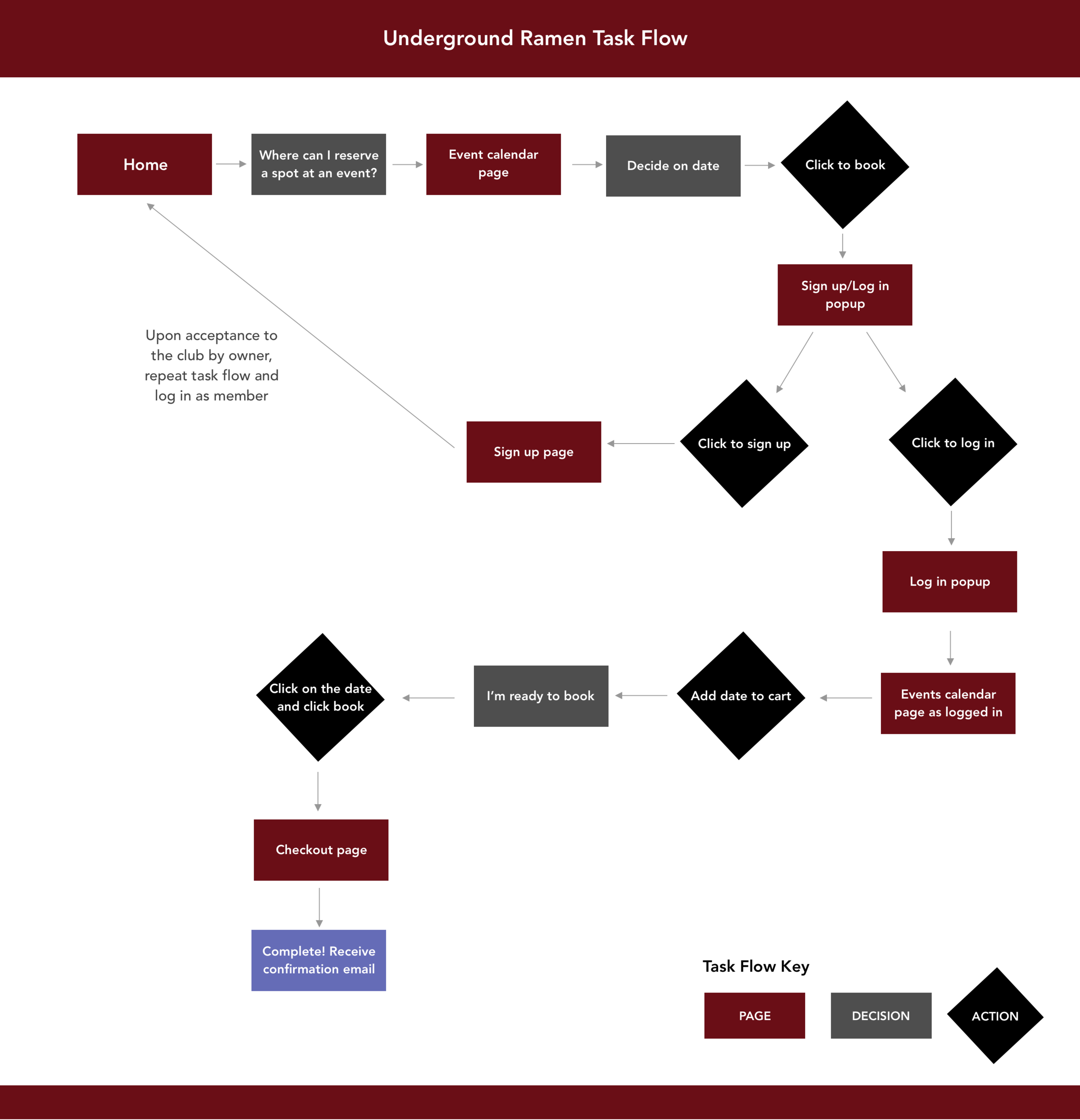
I focused on two key areas when it came to organizing the information and the intended flow of the website- the sitemap and the task flow. Developing a clear task flow for the booking/reservation process was critical since that experience would be a major feature of the website.
Task Flow - reducing friction
An important part of the complete flow for signing up to attend a club event is that the club owner wanted to accept each person individually to the club. As such, someone would have to request to join the club, be accepted as a member, and then as a member could register for events. It was important to accommodate this request of the business owner, while keeping the overall user experience of the website as friction-less as possible.
Low & Mid Fidelity Wireframes
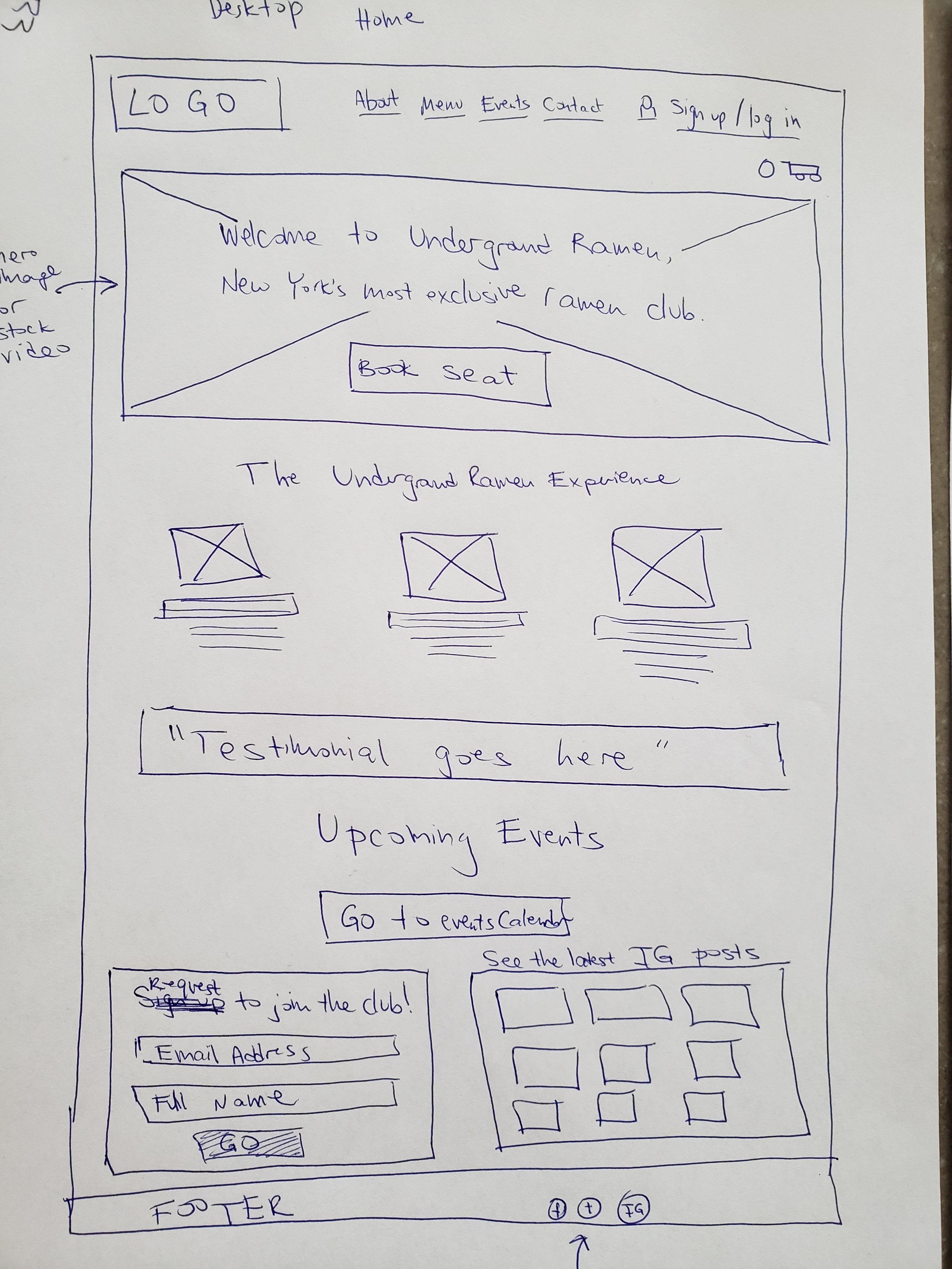
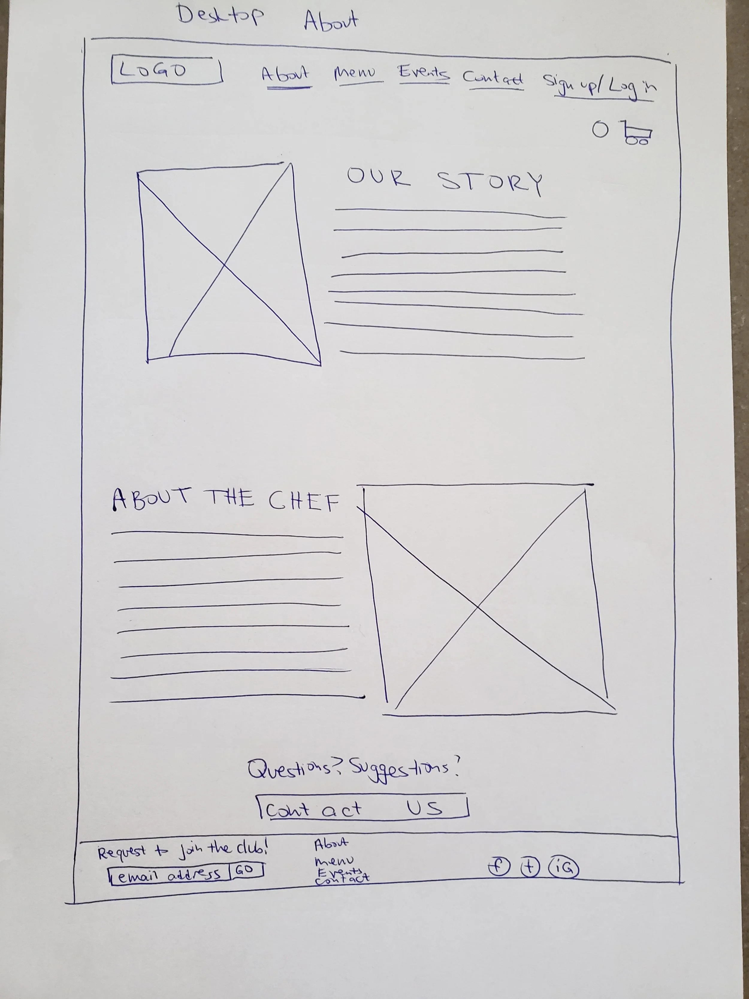
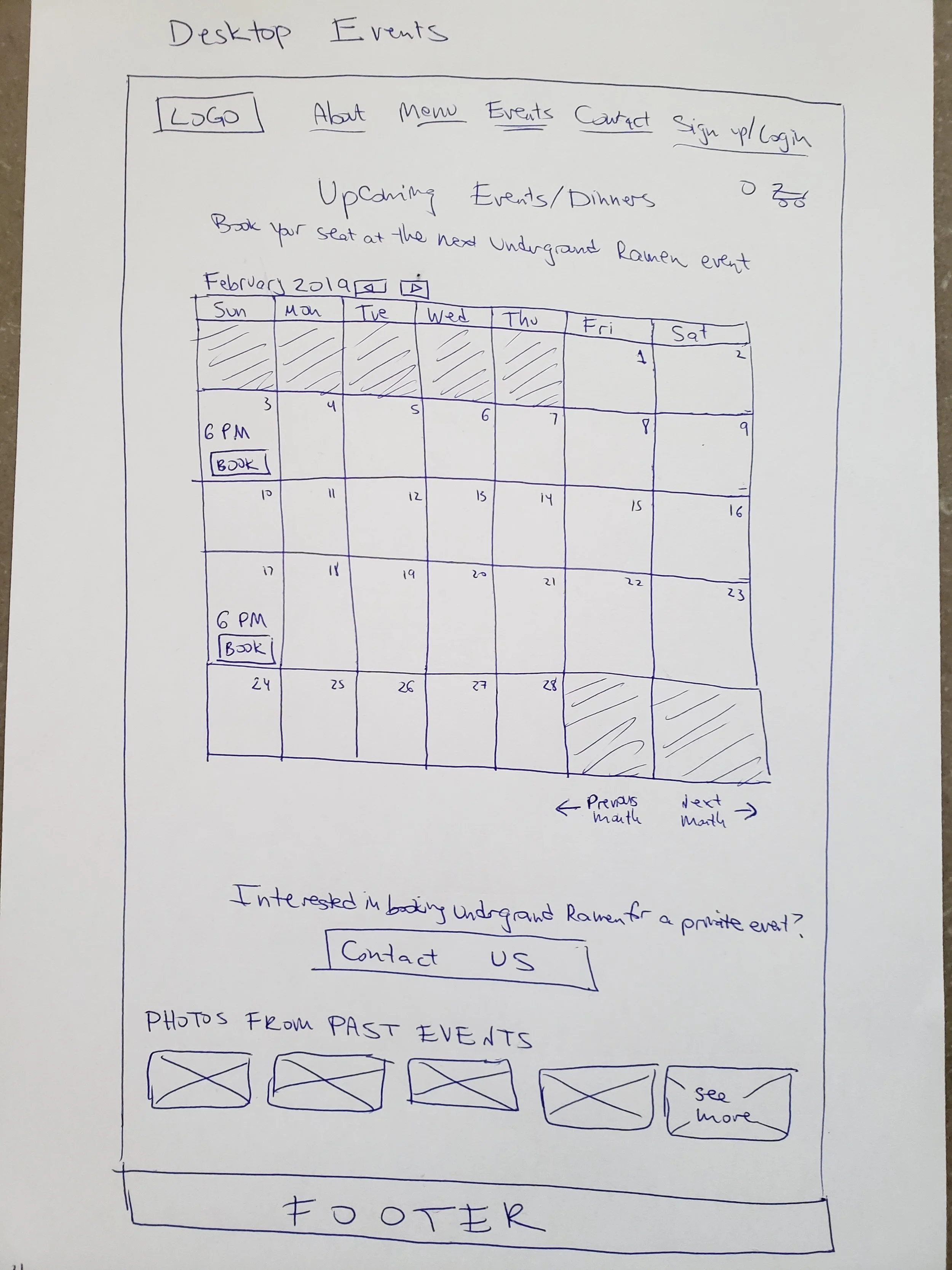
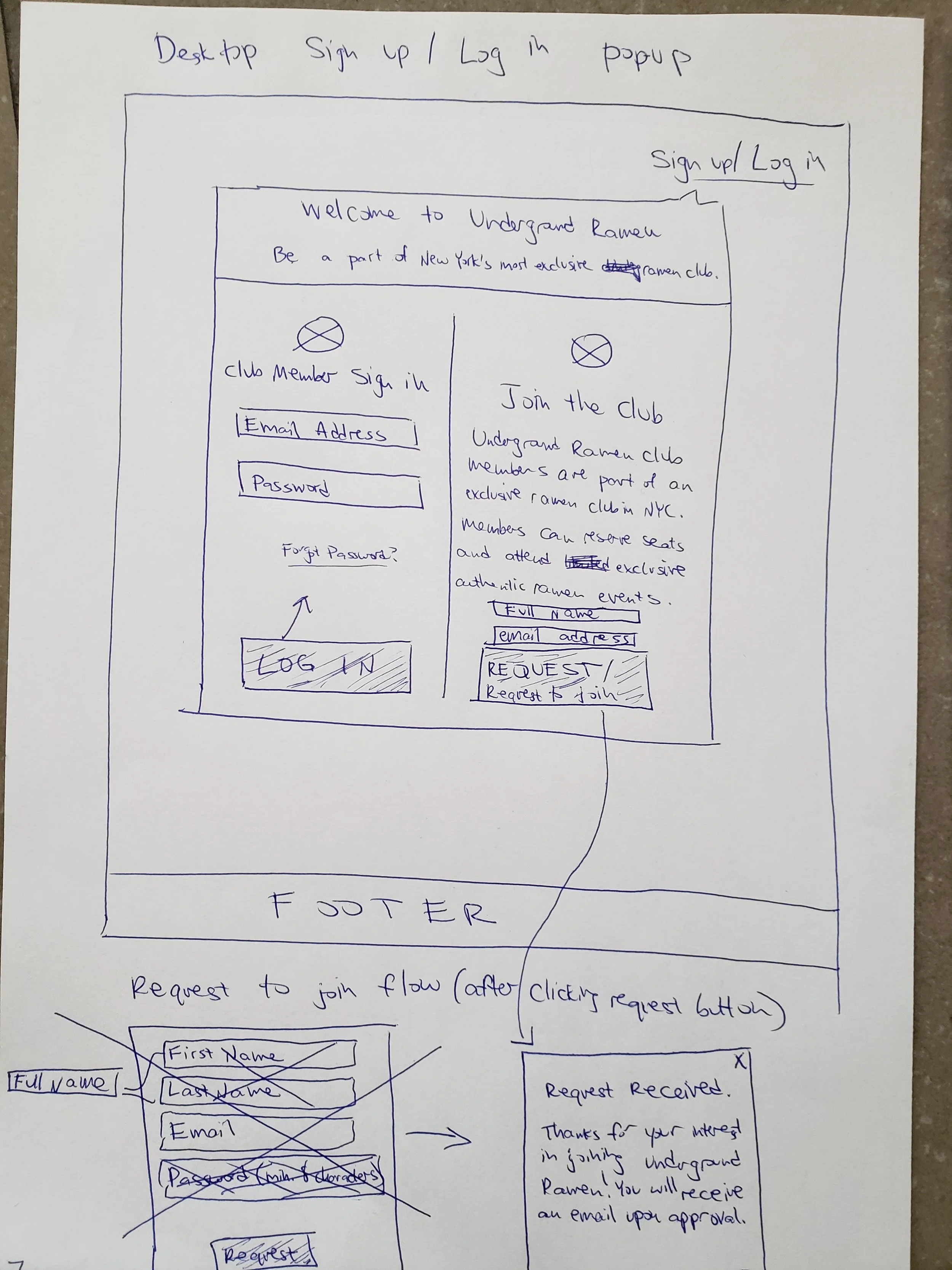
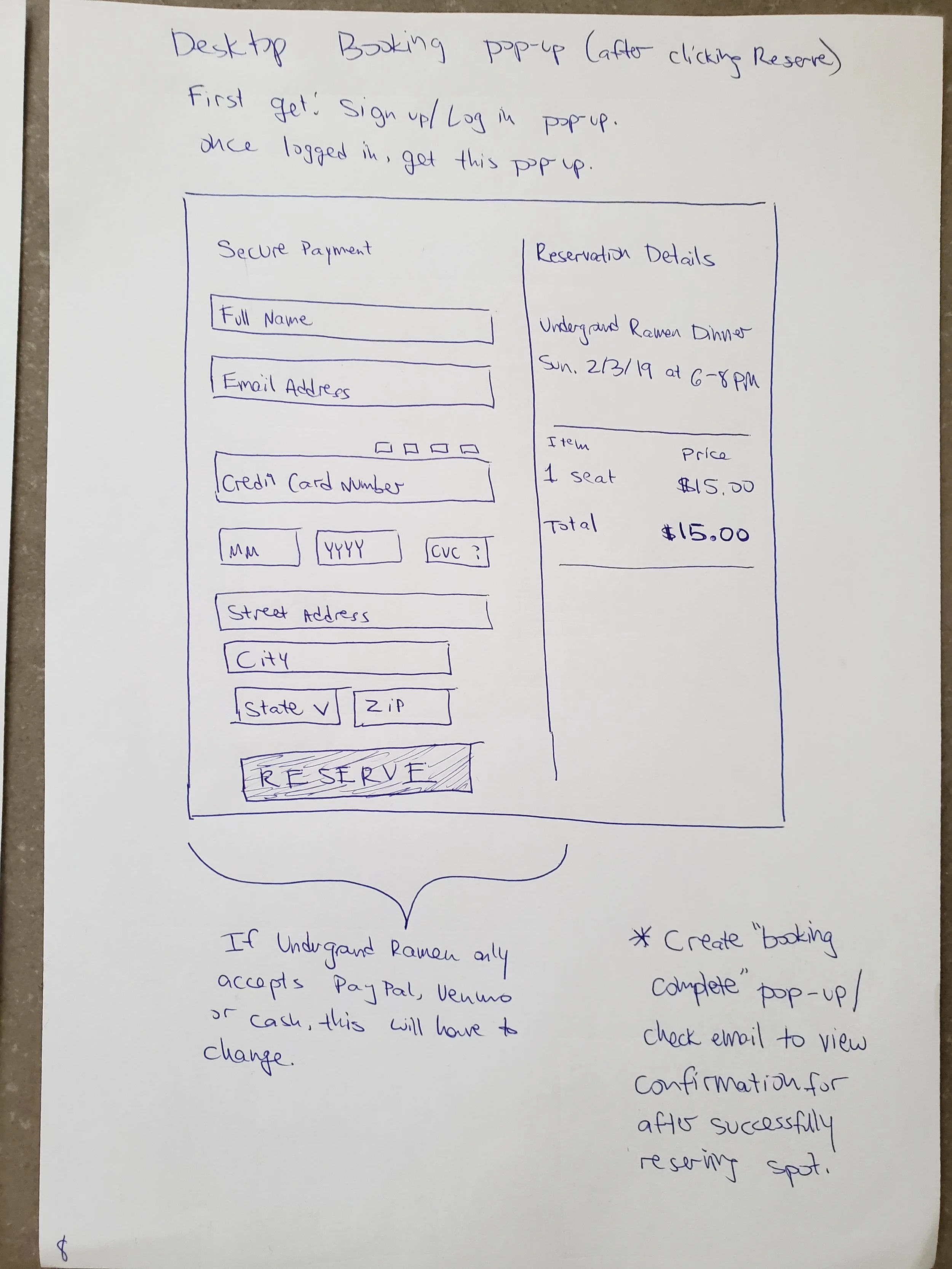
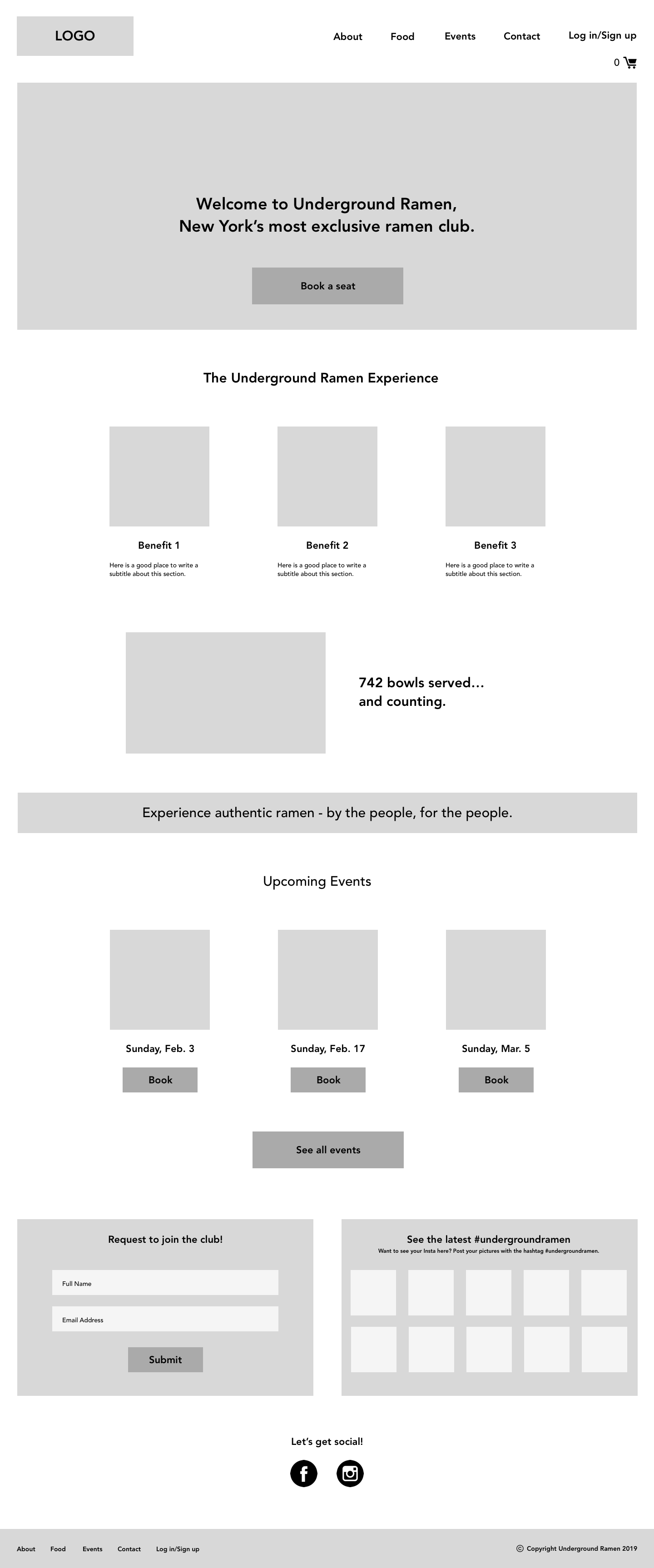
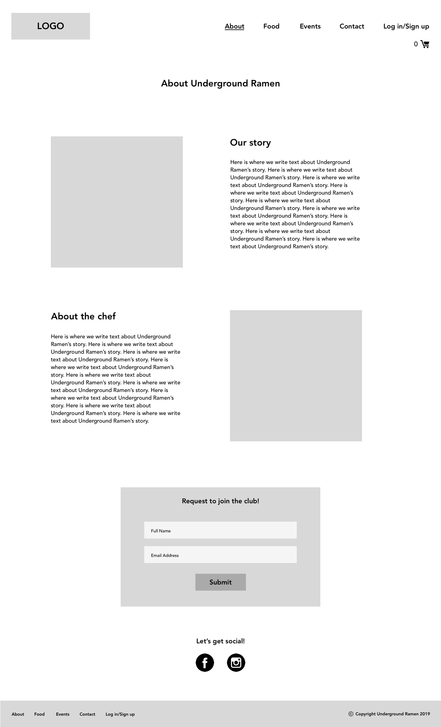
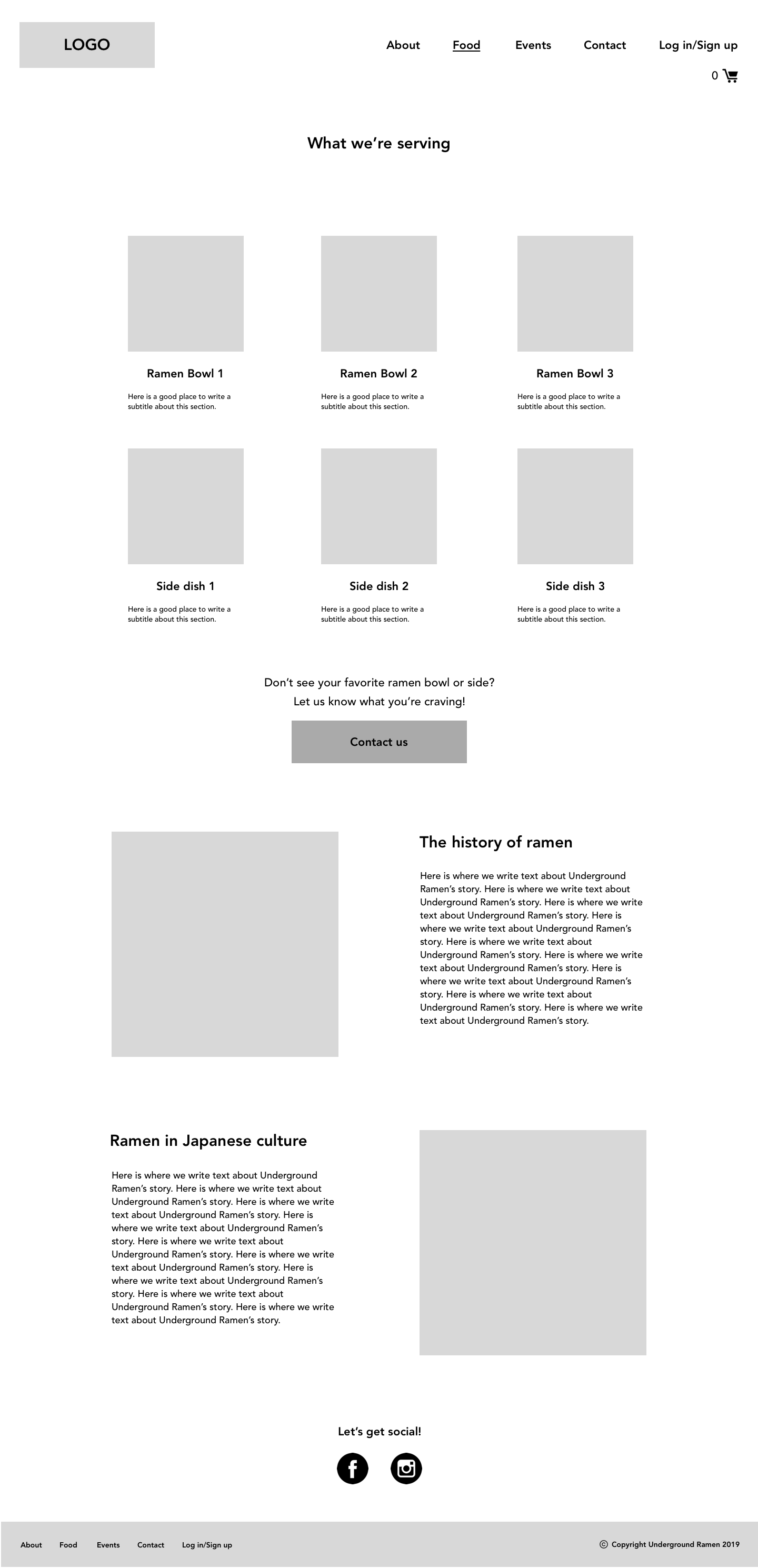
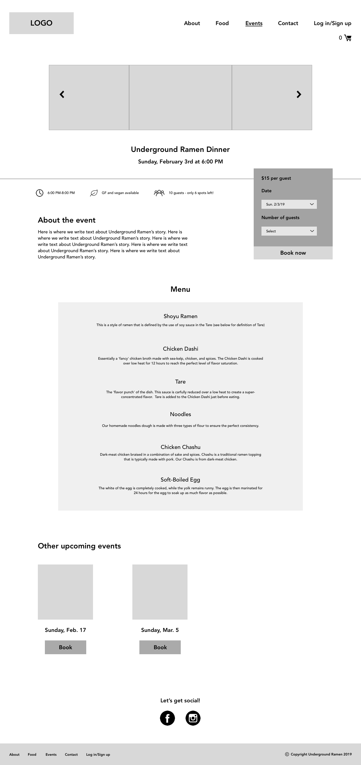
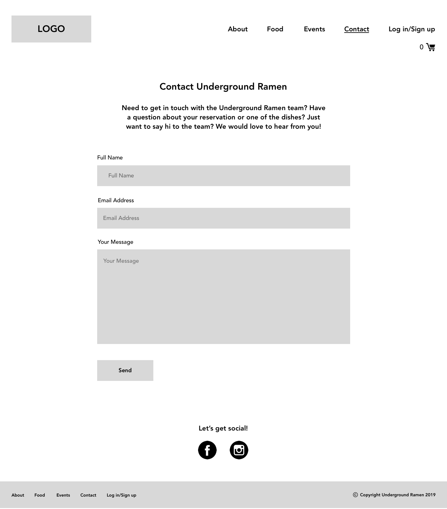
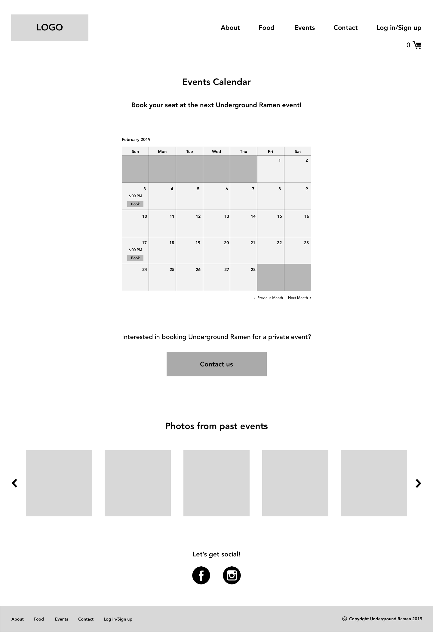
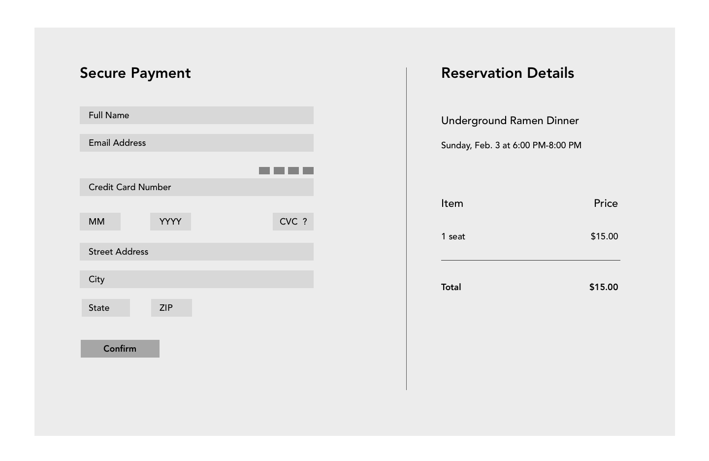
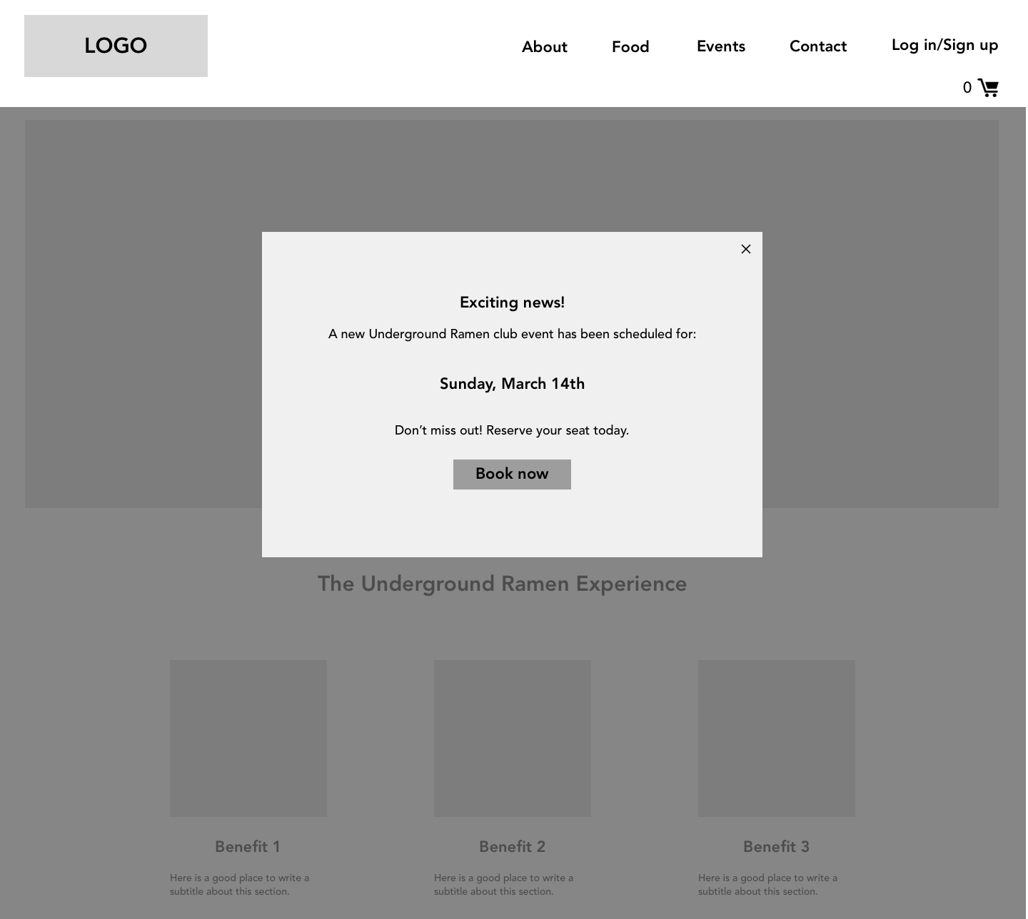
Based on the research and structure, wireframes of all screens for desktop and mobile were sketched out on paper, and then redone and refined in Sketch. The goal of this phase was to plan out as many features and flows as possible at this early stage in the design process.
First I sketched out all screens by hand (desktop screens below).
In between the sketching and digitizing the designs in Sketch, I was able to refine some of the flows and make other design decisions for the mid-fidelity screens shown below.
Branding and UI
Before continuing to refine the designs, I developed Underground Ramen’s branding based on the existing logo provided to me and observations from the research stage.
This stage included creating:
Icons
Buttons
Colors
Typography
Recoloring the existing logo
UI Kit
The colors I used in this project were sourced from the brand’s existing logo, and observations from my research of authentic Japanese cuisine and underground dining. The choice of font was similarly intentional- I tried to pick a typeface that paired nicely with the logo and that would appeal to the brand’s target customers. Throughout the designs, I included references to Japanese culture and cuisine, for example the black rectangles behind text, which are meant to be reminiscent of chopsticks.
Hi-Fidelity Wireframes and Prototype
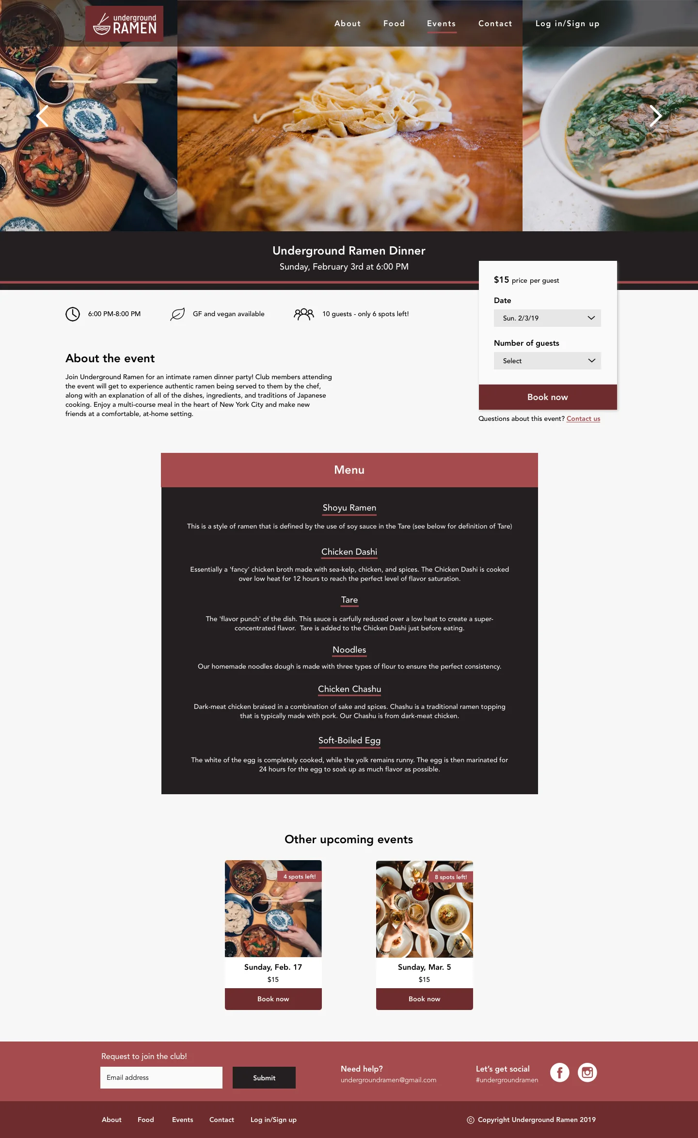
I built out all screens and flows of the website including the entire booking flow, drop down menus on the individual event page, and all of the sign up/log in screens. I added in more definition and all of the UI to the final designs.
Next Steps
I conducted usability testing of the desktop prototype with 4 participants. Based on their behaviors and verbal feedback, I planned the next steps to improve the usability and overall experience of the website. This includes:
A logged in state for members
Feature showing which members are signed up to attend events
Complete building out the Sign up/ Log in feature
Incorporating booking for multiple people (and ensuring that they are all club members)
Many of these features are currently being designed and implemented. The final designs will be provided to the business owner to have the website built.

