
Project Overview
Dose is a fictional company launching a mobile app to help people track their pills and manage their medications. This app is intended for everyone from young teens with chronic illnesses to baby boomers who are trying to stay organized with all their pills.
Dose wants to build an iOS app for iPhone X that allows users to:
Add new medications
Know when to take a dose
Easily access medication details
Organize their care provider information
Health care is a topic that I am personally passionate about, and a large part of my professional background. My aim was to create a mobile app that would encourage real people, just like everyone I know who takes medications, to be proactively engaged and on top of their medications. Throughout the duration of this project, I consulted with various individuals including health care professionals and people with chronic illness to better understand patients’ needs.
Project Duration: 4 weeks
Tools Used: Sketch, Figma
Role: Research, Information Architect, Branding, UI, Interaction Design, Prototyping, Visual Design
Research
I had 3 primary research goals:
Research medication management apps to understand the features they offer
Research pill tracking habits and medication management behaviors of real people
Research app design styles, branding, and content that reflect healthy living
METHODSPrimary/Market Research
Competitive Analysis
1-on-1 Interviews
Anonymous Survey
FINDINGS
I conducted a competitive analysis of 5 other medication management apps available for both iOS and Android.
The strengths identified across the different platforms included:
Clear visualization depicting adherence of prescribed doses
Imagery of each prescription medication
Instructions for how to take each dose
Easy flow for inputting new medications
Easy flow for logging when a dose is taken
An anonymous survey conducted with 33 participants between the ages of 21-85 led to some significant findings. The survey included 6 participants age 50+, which was valuable since the app is intended for users of all ages, especially the growing population of baby boomers. Not only was the survey important for understanding what features to prioritize, but it reaffirmed that this kind of app would be used if available on the market.
The most significant results from participants included that:
70% take prescription medication
50% take medication for a chronic illness
75% have missed a dose
60% keep track of their prescriptions by “remembering it in their head.”
50% have struggled to find their provider’s contact info or instructions
60% would want to see a calendar showing how consistently they take their medications
85% would want to be alerted when they are running low on a prescription
42% are aware of how their medications interact
A series of individual interviews was helpful in supporting findings from the anonymous survey with some more anecdotal explanations. I found that participants wanted to be reminded to take a medication during a window of time, being reminded every 15 or 30 minutes, and would go away once dose is logged. Notably, one of the participants who manages a chronic illness said that she would be interested in a function that would let her family members track her adherence so they could make sure she was taking her medications every day.
“If I have to enter my medication details manually, I probably won’t end up doing it. But if I can somehow scan the prescription- that I would do.”
Based on the research findings, I decided that the Dose app should include:
Reminder to take a medication during a window of time with push notifications
Way to refill a prescription, request a refill, and alert when running low
Easy way to import a new prescription and all instructions
Provider contact information, with who prescribed each medication
User friendly details and info about interactions and instructions for all medications
A calendar tracking adherence so that they could see for their own knowledge what medications they have been taking and how compliant they have been
Information Architecture & Interaction Design
During this phase of the project, I created a user persona that represented many of the people who participated in the anonymous survey, who find that keeping track of their health conditions and medications can be a burden that gets in the way of their life. The survey research found that when people were asked how important they believe it is for people to maintain excellent adherence to taking their prescription medications on a scale of 1-5, the average response was 5. The user I created, Melissa, reflects that value of prioritizing her health so she can continue going about her life.
I also created a Dose sitemap and task flow during this phase, to help chart out the hierarchy and structure of the app, and to build out the intended flow of a typical Dose user. The functions and behaviors determined during this phase were brought to life in the interactive prototype.
Low & Mid Fidelity Wireframes
Based on the findings and structure determined in the previous stages, I sketched out the screens for all of the anticipated user flows. I knew that the app had to be “familiar” to users and feel like apps they are used to interacting with.


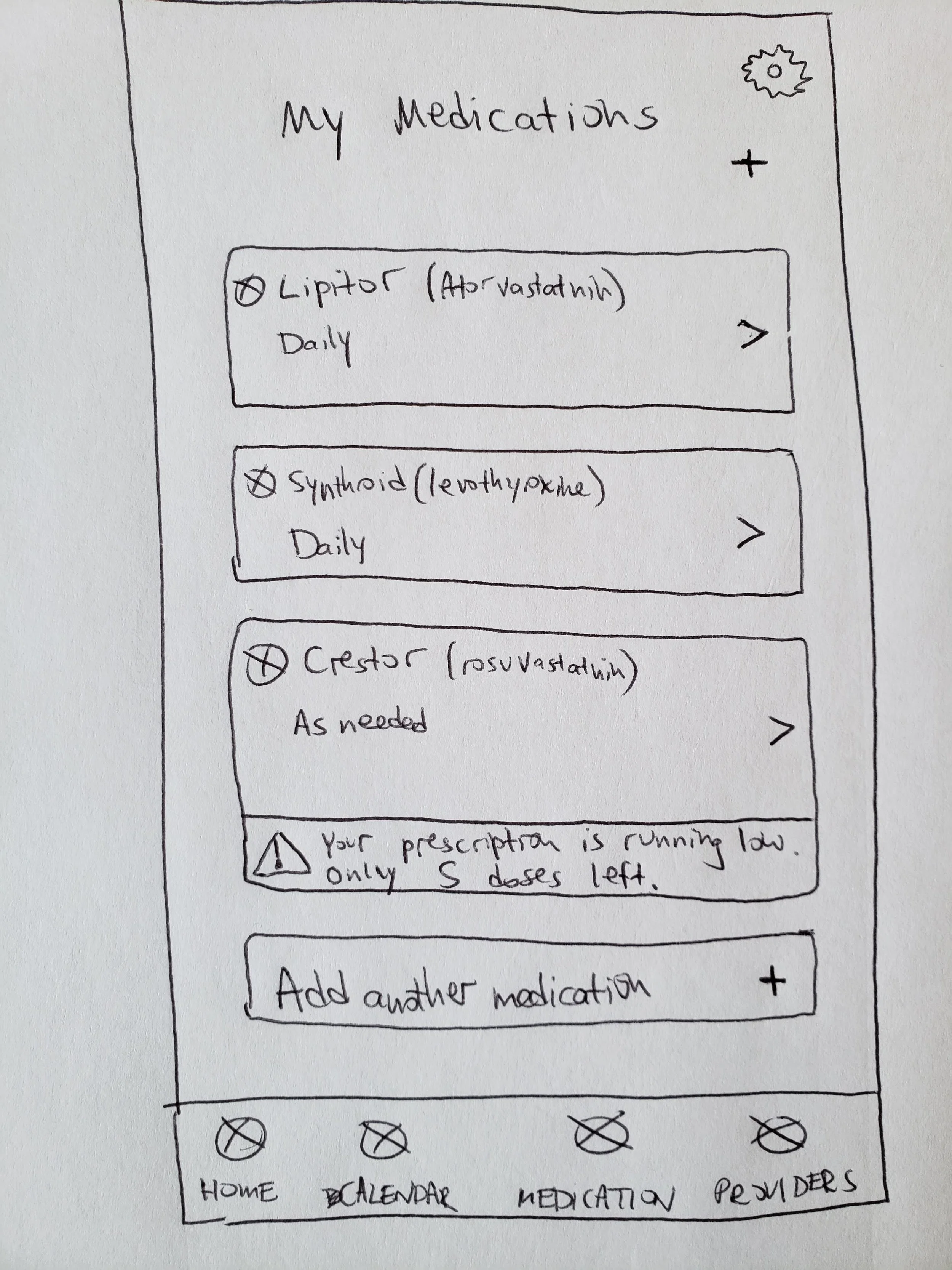


In between the sketching and digitizing the designs in Sketch, I was able to refine some of the flows and make other design decisions for the mid-fidelity screens shown below.


After completing the low and mid-fidelity designs, besides for adding in more definition and UI, there were a few key takeaways to incorporate into the final designs based on feedback:
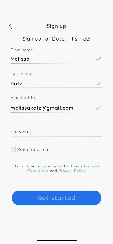
Redo sign up/log in concept
Remove weekly counter in Home Dashboard
Consider ways for users to add in a one-time (quick add) medication like Advil
Give users a way to edit their reminder settings for a dose
Make additional medication details expandable
Branding and UI
I researched other health care related apps to understand what the best design style would be for Dose. I wanted the UI to be incredibly easy to understand and navigate, I wanted the text and colors to be clear and accessible for people of all ages, and I wanted to use designs that make medication management feel simple, manageable, and positive. I chose to use isometric style icons because of their particularly clean and somewhat realistic look.
With all this in mind, I built a UI kit that included icons, a logo, buttons, colors and typography.
Hi-Fidelity Wireframes and Prototype
I added the UI into the designs, and further refined the designs of some key screens to improve usability and eliminate anything that was not absolutely necessary or useful for users. This included simplifying the top of the Home page, incorporating a “check” feature into all forms, and refining the way users can set and edit reminders for their medications.
View all of the final designs and how they interact in the full prototype below.


Next Steps
I conducted usability testing of the app prototype with 2 participants. Based on their behaviors and verbal feedback, I planned the next steps to improve the usability and overall experience of the app. This includes:
Sync Tracker to iCal or Google Calendar
Build a way for users to request prescription refills
When adding a new Quick-Add medication, default time in picker should be current time
Way to upload image of each pill or search image from database
Google Maps integration to Provider details
Reconsider just using 2 colors in Tracker (for Complete and Incomplete)
View other projects
Chase Bank
A financial management tool for an existing mobile app
Underground Ramen
A responsive website for an underground dining club