
Project Overview
As mobile usage for banking continues to grow, especially among millennials, Chase Bank is focused on strengthening their offerings on their mobile app.
Most customers have largely used the Chase mobile app to view transactions and make payments. They are now looking to expand their personal finance management capabilities for their mobile app, and provide users with personalized features that help them manage their finances.
The goal of this project was to identify and design a feature to add into the existing Chase mobile app for Android that would help customers with their financial challenges.
Project Duration: 4 weeks
Tools Used: Sketch, Adobe XD
Role: Research, Information Architect, Branding, UI, Interaction Design, Prototyping, Visual Design
Research
I had 4 primary research goals:
Identify where a new feature could be added into the existing structure of the app
Research banking apps to understand their offerings
Research financial management challenges of people, especially millennials
Identify a specific feature for financial management that would best benefit customers
METHODS
Primary/Market Research
Competitive Analysis
1-on-1 Interviews
Anonymous Survey
FINDINGS
An anonymous survey included 38 survey participants between the ages of 20 and 84, with a mean of 27 years old showed that most participants feel that they know how much money they spend each month [chart 1], but that half of them would like to keep better track of their spending [chart 2].
Consumers are interested in a tool that will allow them to track and categorize their spending, based on the discovery in the competitive analysis. Consumers are frustrated by being unaware of their overspending in different categories, and would like to be able to spend or underspend on their budgets to achieve savings goals. Consumers are interested in a tool that requires little set up, and allows them to see the areas of their spending, as well as alerting them when they are spending more than usual.
Notably, there was no consensus when it came to consumers’ financial goals [chart 3]. Therefore, the research suggests that there is a need for a flexible multi-purpose tool that can be customized towards unique financial goals.
“I wish that this kind of thing was easier to set up initially… I don’t like taking the time nor do I have the patience to set it all up.”
After conducting my research, I created a user persona that captures who the intended user of the website is, to help guide the next steps of the project, and focus the designs around the intended user.
Information Architecture & Interaction Design
Maintaining the existing organizational structure of the app was a unique and rewarding challenge of this project, from both research and design perspectives.
I created a sitemap and a task flow to guide the design process, and a user persona who represented the intended user, to help inform further key decisions.
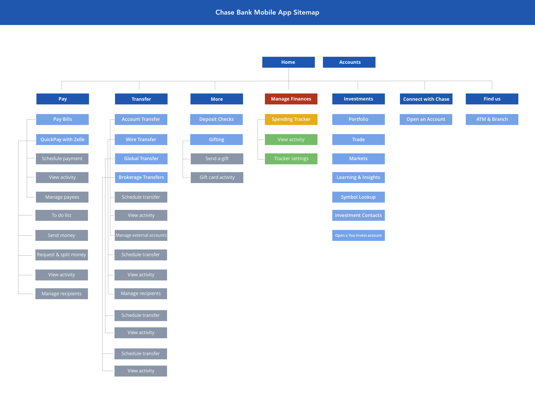
Sitemap - finding the natural fit
This project focused on building a new feature into an existing product. I replicated the structure of the entire existing sitemap, and identified the places where the new feature best fit into the hierarchy. I added in the Manage Finances section and subsections for the new feature.
Low & Mid Fidelity Wireframes
With the existing app open on my Android device the entire time, I sketched out the initial designs of all key screens on paper.


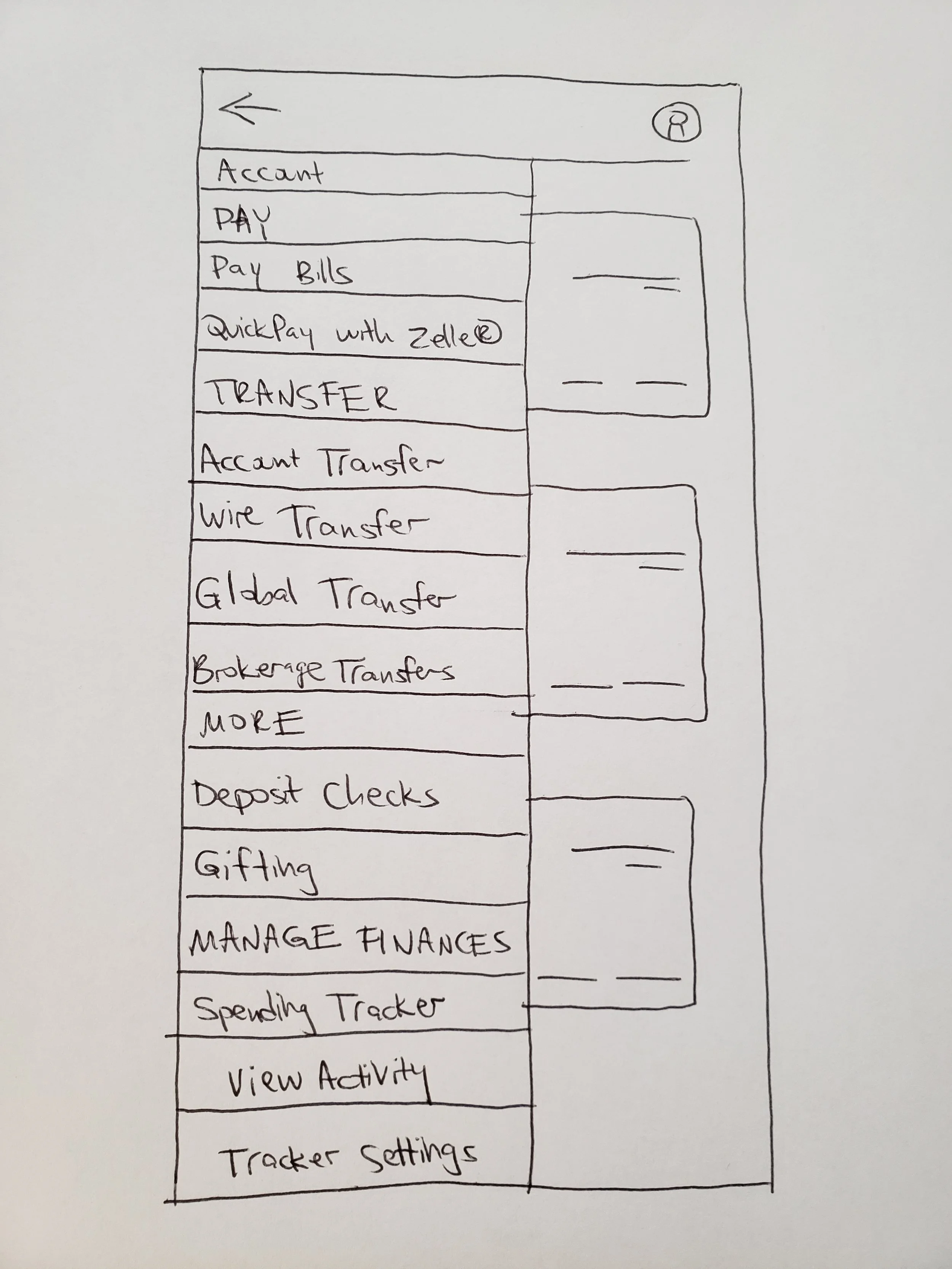


In between the sketching and digitizing the designs in Sketch, I was able to refine some of the flows and make other design decisions for the mid-fidelity screens shown below.


Branding and UI
For this project, identifying and maintaining consistency of the UI was critical.

UI Kit - maintaining consistency
I did significant research to find or replicate all of the UI elements of the existing product, and incorporate them into the new feature. Everything from line thickness to spacing between text was taken into account.
Hi-Fidelity Wireframes and Prototype
For the final designs, I made some changes to shorten the flow of the user from the home dashboard to the new feature. Incorporating the exact UI of the Chase Bank app for Android into the designs was an important focus of this project, to make the feature as realistic as possible.


I built the final prototype in Adobe XD, where I was able to include all the interactions of the existing app and re-create that experience for the testing participants.
Next Steps
I conducted usability testing with 6 participants. Based on the feedback, I planned the next steps to improve the usability and overall experience of the feature within the app. This includes:
Incorporating the yearly spending history as a tab within the Spending Activity
Planning out a way to discern between categories of purchases made at a single general store (i.e. clothing and groceries both bought in one purchase at Target)
Displaying any alerts set for a category on the category deep dive page
Managing and viewing any existing alerts for all categories
Designing the concept of how subcategories would be presented
View other projects
Mirror
An ecommerce website for a global clothing brand

Dose
An iOS app to manage medications and simplify health care