
Project Overview
For this project, I created a responsive website and branding for a fictional international clothing company, Mirror, who was looking to rebrand and redesign their online store. My aim was to create a website that made it easy for customers to browse and filter products and feel like they were finding the best products for their style at prices that they love.
Project Duration: 4 weeks
Tools Used: Sketch, Figma, Zeplin, InVision, Marvel
Role: Research, Information Architect, Branding, UI, Interaction Design, Prototyping, Visual Design
Research
The goal of my research was two-fold. I wanted to:
Identify and understand Mirror’s target users and their needs
Gain an understanding of the offerings of Mirror’s market competitors and the features that contributed to the overall experience of shoppers
METHODS
Primary/Market Research
Competitive Analysis
1-on-1 Interviews
User Persona
Empathy Map
Storyboard
Project Goals Venn Diagram
Mirror User Persona
“My biggest fear when shopping online is that I will buy something, it won’t fit as I expected, and then I will have to pay to return it. Just not worth it.”
“I’m a busy person, so I like to save time by shopping online and filtering for the items I’m looking for. Finding what I need at a price that I can afford is my main goal.”
FINDINGS
Overall, what I discovered through my competitive analysis, interviews and other research was that customers are focused on the time and cost of shipping, the clothing fit, texture, and color being what they expected, and finding great prices and deals. I decided that the target customer was a young, busy professional on a budget, but with a strong sense of personal style.
Based on the findings, I decided that Mirror’s new website & branding should include:
Free shipping and returns
Clean, unisex designs
Exclusive deals available only online
Product reviews that focus on fit, color and texture accuracy
Intuitive and comprehensive filters
Information Architecture & Interaction Design
Once I had completed the research stage, I began to organize all the content with a few questions in mind:
How would the site be structured? How would different types of clothing be grouped together? What were users expecting to find when they opened up a clothing website?
METHODS
Card Sorting
Sitemap
Product Features Roadmap
User and Task Flows
After completing a card sorting exercise and researching how similar industry competitors structured the content on their websites, I was able to create a sitemap. The sitemap evolved throughout the iterations, but served as the structural backbone of my project.
Mirror Sitemap
I then set out to create user and task flows. While my user flows helped me understand the potential behaviors and decisions that make up the twists and turns of every individual’s experience, my task flow helped formulate a single ideal, uninterrupted, flow for one core task.
Wireframes
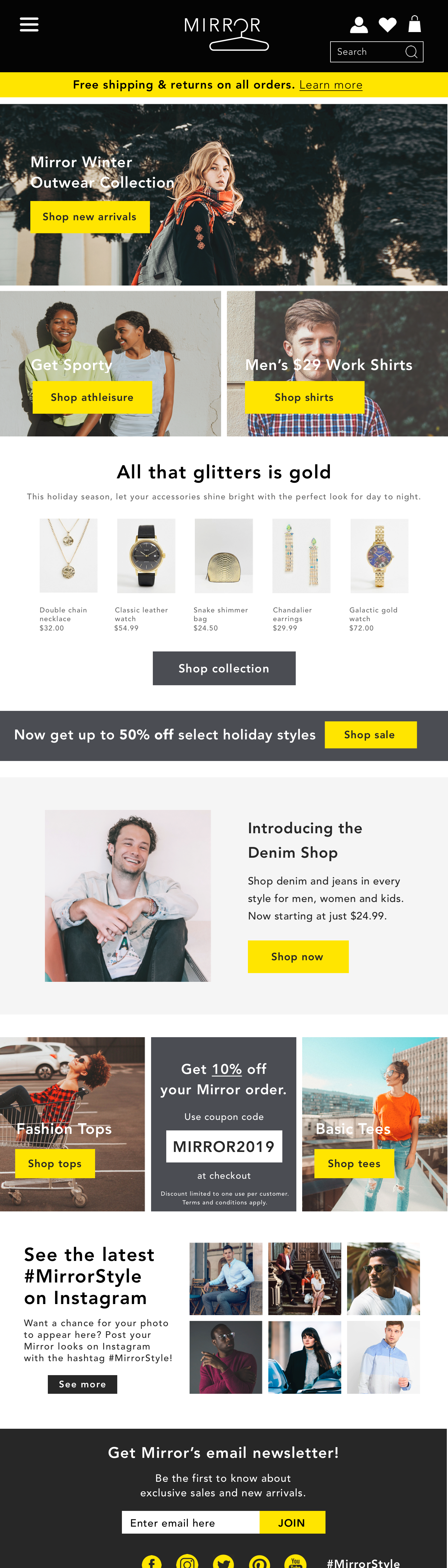
Based on the research and the structure I had developed, I sketched and then built out my initial wireframes of the key screens of the desktop and mobile versions of Mirror’s website (Home, Search Results, Product Page).


Doing this step and then conducting user testing on a basic prototype of these wireframes was critical. I was able to learn what users found intuitive and what they did not before continuing to refine the designs.
Branding and UI
Before continuing to refine the designs, I developed Mirror’s branding, largely based on the findings from the research stage of the project.
This stage included creating:
Logo
Icons
Buttons
Colors
Typography
Style Guide
UI Kit
Using the UI kit as a reference guide helped establish consistency across the product.
Mirror UI Kit
Hi-Fidelity Wireframes and Prototype
I incorporated the branding and UI into the wireframes and made significant revisions based on feedback and testing. For the prototype, I further revised the header and decided to move the big sale banner to the top. I also fully built out the Search Results page and added in design features such as a dropdown menu and pop-up shopping cart.


Next Steps
Based on the usability testing I conducted with my hi-fidelity prototype and the resulting affinity map, I planned the next steps to further refine Mirror’s website design and flow:
Move big sale to top of home page
Add price drop to sale items
Re-evaluate icons
Add more filter options
Add sign up/log in button
Continue building checkout designs
Many of these next steps have already been added to the updated prototype.
View other projects

Underground Ramen
A responsive website for an underground dining club

Dose
An iOS app to manage medications and simplify health care